Convert in 90 Seconds: Service Page Design Templates for Contractors
# Convert in 90 Seconds: Service Page Design Templates for Contractors
A high-converting service page does three things in the first screen: it names who you serve, states the outcome you deliver, and gives visitors an obvious next step. Everything below that fold, from trust signals to pricing cues, exists to remove friction between "interested" and "booked." The pages that fail do it because they bury the offer, hide the CTA, or make visitors hunt for proof. The rest of this guide shows you the modules, templates, and examples to fix that.
*
TL;DR: - Most service pages fail because they hide the offer, obscure the CTA, or make visitors search for proof, reducing conversions. - A structured seven-module layout—hero, trust signals, problem framing, service breakdown, process, social proof, and final CTA—helps visitors decide within 90 seconds. - The hero should clearly state who you serve, what outcome you deliver, and be followed by a visible CTA above the fold; trust signals and benefit-focused sections reinforce credibility. - Mobile design must prioritize a clear focal point, with a large CTA button, stacked elements in priority order, and accessible features like color contrast and keyboard navigation. - Effective headlines combine outcome, audience, and a direct CTA, while social proof should be placed near relevant claims with repeated CTAs after proof blocks for maximum trust.
*
Table of Contents
- —What Makes Service Page Design Convert?
- —Layout Patterns and Examples Worth Copying
- —What Do Layout and Mobile Rules Actually Require?
- —How Do You Write Headlines and Pricing Cues That Convert?
- —What Should Your Process Section Promise?
- —Which Social Proof Formats Actually Build Trust?
- —CTA Wording and Small Tests Worth Running
- —The Plug-and-Play Service Page Template
- —How Vaultio Builds Service Pages That Book Jobs
- —Why Clarity Beats Decoration Every Time
- —Get a Service Page Built to Book Jobs, Not Just Look Good
- —Sources
- —FAQ
What Makes Service Page Design Convert?
Visitors decide whether to stay or bounce within seconds. A structured 7-module order gives them everything they need to decide inside 90 seconds: hero, trust strip, problem framing, service breakdown, process, social proof, and a final CTA paired with FAQ. Skip a module and visitors either leave or email you questions you should have answered on the page.
Your hero has one job: answer what you do, who it's for, and what outcome the visitor gets, all before any scrolling. Put your primary CTA above the fold, not buried under three paragraphs of company history.
Directly under the hero, a trust strip does the credibility work fast: client logos, a star rating, a project count, or a "trusted by 200 homeowners" line. Below that, break your service into benefit-first sections rather than a features list. If you offer tiers, show them side by side so visitors self-select instead of guessing.
Other elements that consistently show up on effective service pages include:
- —A headline stating outcome and audience together
- —Real images or short video of the work, not stock photography
- —Social proof placed near the claim it supports
- —A visible pricing cue, even if it's just a starting range
- —FAQ addressing pricing, timeline, and scope objections
- —A final CTA that repeats the exact action from the hero
Layout Patterns and Examples Worth Copying
Three layout patterns cover most service pages. A three-column feature grid works when you're presenting parallel options, like service tiers or add-ons, and want visitors comparing at a glance. Alternating image-and-text blocks suit a step-by-step story, like a renovation process or a multi-stage consultation. Card layouts fit tiered pricing because they let you stack a CTA inside each card, so the decision and the action sit in the same visual unit.
Hero media matters more than most redesigns account for. A photo sets tone fast and loads instantly. Video builds trust for higher-ticket services but adds load time that can hurt mobile conversion if not compressed. A short interactive demo works only when the service itself is visual, like a design or renovation portfolio.
Design galleries like Dribbble's service-page collection are worth browsing, but treat them as a source of layout ideas, not conversion proof. A gallery entry can look beautiful and still hide its CTA below three scrolls. Annotate what you borrow:
- —Note where the CTA sits relative to the fold
- —Check whether trust signals appear before or after the ask
- —Look for how pricing or scope gets hinted at without a full quote
WasherAuthority's contractor site work is a useful reference for home-service verticals specifically, since the layout choices there reflect how homeowners actually shop for trade services.
What Do Layout and Mobile Rules Actually Require?
Visitors form a judgment in three to five seconds. That window has to contain your hero image, your one-line promise, and a visible CTA button, not a hamburger menu and a stock photo carousel. Use size and whitespace to create exactly one focal point per screen. If three elements compete for attention, none of them win.
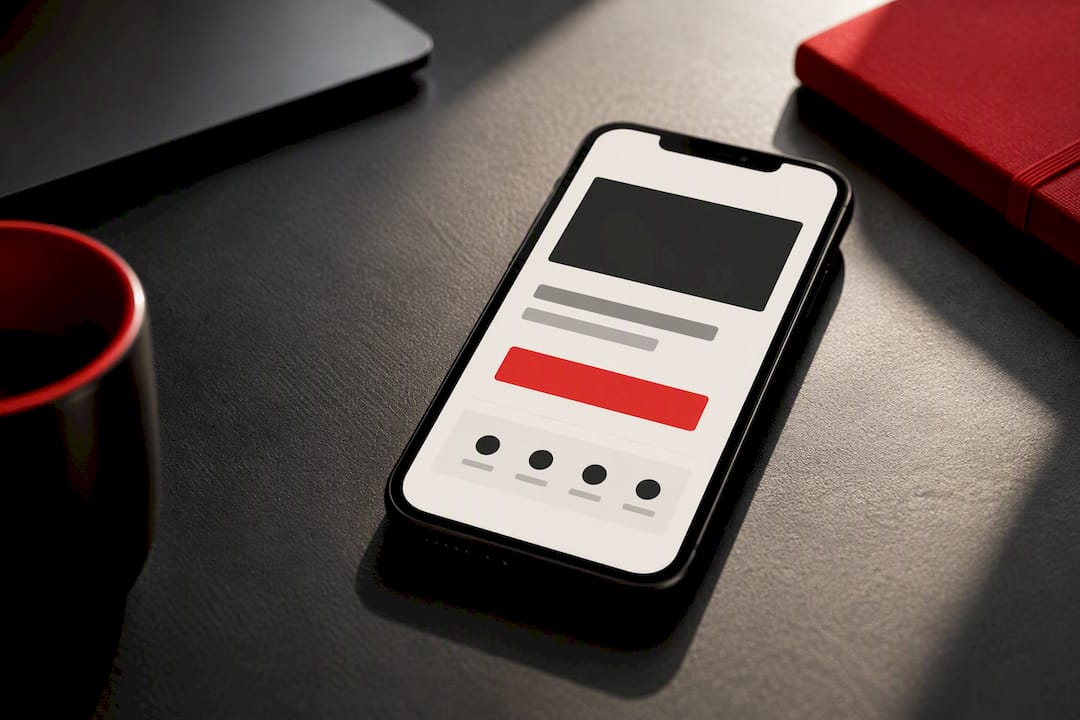
On mobile, stack in this order: headline, one supporting line, CTA button, then trust strip. Make the CTA button large enough to tap without zooming, at least 44 pixels tall. For accessibility, keep color contrast at a 4.5:1 ratio for body text, add alt text to every meaningful image, and make sure the CTA is reachable by keyboard navigation alone. A page that scores well on accessibility also tends to score well on mobile conversion, because both disciplines force the same discipline: strip out anything that isn't essential.
How Do You Write Headlines and Pricing Cues That Convert?
Your headline should answer what you do, who it's for, and what they'll get, all in one line. A reliable formula: Outcome for Audience plus a short supporting line plus a direct CTA. "Faster Job Bookings for Home Service Contractors. AI-powered lead response that answers new inquiries in seconds. Get Your Free Audit."
Convert every feature into a benefit before it goes on the page:
- —"24/7 chatbot" becomes "Never lose a lead to a missed call again"
- —"Local SEO package" becomes "Show up first when someone searches for your service tonight"
- —"Automated scheduling" becomes "Booked jobs without a single back-and-forth email"
Publishing a starting price or range tends to increase lead quality by filtering out visitors outside your budget before they ever fill out a form. Add microcopy near your CTA: response time ("We reply within one hour"), a guarantee, and a one-line description of what happens immediately after submission.
Pro Tip: Write your headline last. Draft the body copy first, then compress everything you said about outcome and audience into one sentence. It reads sharper than a headline written cold.
What Should Your Process Section Promise?
A clear process section removes the biggest hesitation buyers have: not knowing what happens after they click "contact." Keep it to four steps with realistic timing:
- 1.Submit inquiry or request a quote (takes 2 minutes)
- 2.Get a response or scheduled call (within 1 to 24 hours)
- 3.Receive a scope and price (same day to 48 hours, depending on complexity)
- 4.Book the work and confirm timing (varies by service)
Use a full pricing table when you sell fixed packages with clear tiers. Use a "starting at" label when scope varies by job, which is typical for most home-service work. Either way, collect enough at intake to avoid back-and-forth: service type, property size or scope, timeline, and zip code. That's usually enough to quote fast without a phone tag chain.
Which Social Proof Formats Actually Build Trust?
Testimonials work best in a tight format: a direct quote, a photo, a first name, and a role or location. Skip long paragraphs. A single sharp sentence next to a real face outperforms three vague ones from an anonymous "happy client."
Case snippets follow a simple arc: the challenge, what you did, the result, with a link to the full case study for anyone who wants depth. Keep the snippet itself to two or three sentences.
- —Place proof directly next to the claim it backs, not in a separate "testimonials" section far from the CTA
- —Show ratings, badges, or a project count near the point where visitors decide to act
- —Repeat your CTA immediately after a proof block, since that's when trust peaks
Placing proof close to the relevant claim, and repeating the CTA right after it, is one of the more consistently cited conversion patterns across service-page audits.
CTA Wording and Small Tests Worth Running
Your primary CTA should name the action, not describe your company: "Book a Free Consult," "Get a Quote in 24 Hours," or "See Pricing." Vague CTAs like "Learn More" waste the moment a visitor is ready to act.
Repeat your CTA three to four times on a standard-length page: hero, after the service breakdown, after social proof, and at the very end. More than that starts to feel pushy; fewer than that loses visitors who scroll past their decision point.
Test in this priority order: CTA copy first, since wording changes often move numbers the most; button color second; then microcopy under the button, like "No obligation" or "Response within an hour." Basic CRO testing guidance backs starting with copy before visual tweaks, since copy changes tend to move the needle faster than color experiments.
The Plug-and-Play Service Page Template
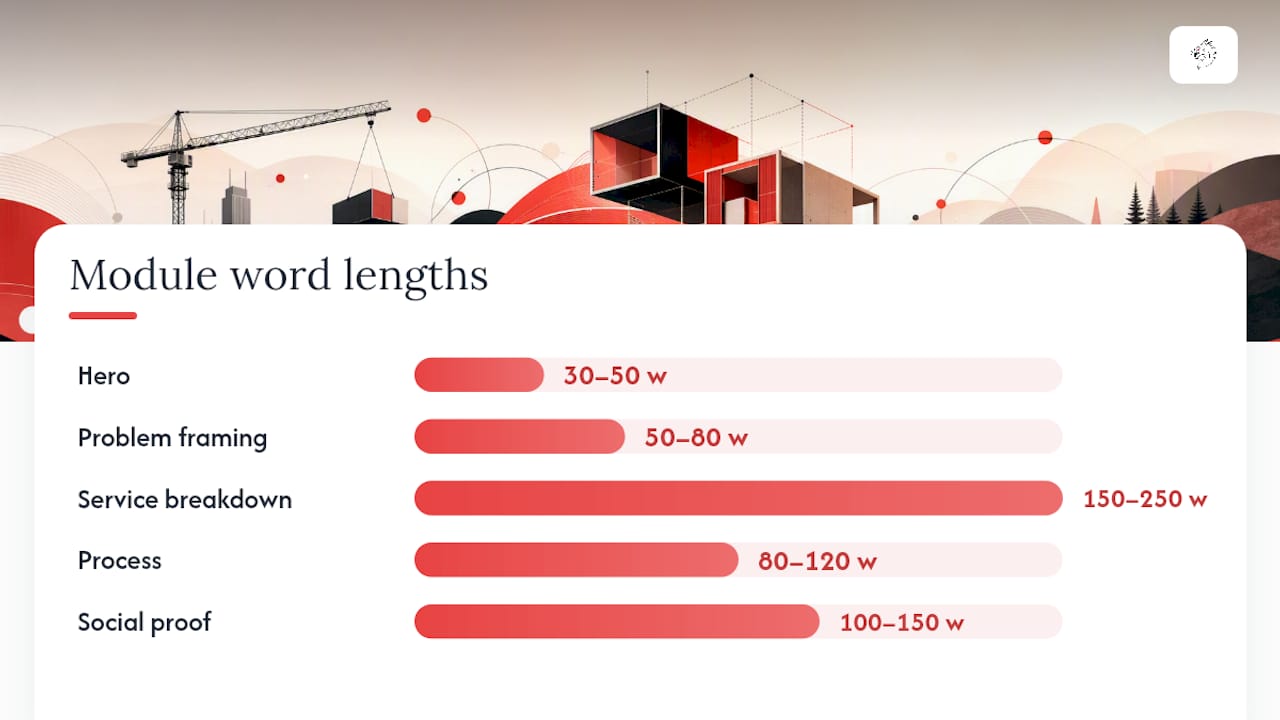
Most small-business service pages run 800 to 1,500 words total across every module. High-ticket offers can run longer if the extra length answers real objections rather than padding.
Top-to-bottom order: hero (30 to 50 words), trust strip (visual, minimal text), problem framing (50 to 80 words), service breakdown (150 to 250 words), process (80 to 120 words), social proof (100 to 150 words), pricing cue, final CTA, FAQ.
| QA item | What to check |
|---|---|
| Single CTA phrase | Same wording repeated, not five variations |
| Proof before every CTA | Testimonial or metric sits above each ask |
| Mobile scan test | Full page readable in under 30 seconds on a phone |
| Structured data | Service schema markup present |
| Analytics wiring | CTA clicks and form submits tracked as events |
After launch, watch click-through rate on your primary CTA and your contact-to-lead conversion rate weekly for the first month.
How Vaultio Builds Service Pages That Book Jobs
Vaultio designs service pages specifically for home service contractors, pairing conversion-focused layout with the SEO and lead-response systems that actually drive traffic to that page. The web design work follows the same module logic covered above: clear hero, fast trust signals, and a CTA that connects directly into automated lead capture, so an inquiry gets a response in seconds instead of sitting in an inbox overnight. Contractors comparing their old brochure-style sites against a rebuilt, mobile-first page often see the difference show up first in form completions, then in booked jobs. That's the standard Vaultio holds itself to on every rebuild: a page engineered to convert, not just display.
Why Clarity Beats Decoration Every Time
Most service page redesigns fail because they optimize for looking impressive instead of being clear. A cleaner font or a bigger hero image feels like progress, but it rarely moves the conversion number. Treat every service you offer as its own conversion asset with its own headline, its own proof, and its own CTA test, rather than one generic page trying to cover everything.
The teams that actually improve their numbers are the ones tracking micro-conversions, like scroll depth to the pricing section or clicks on the FAQ, and adjusting based on that data instead of gut feeling. Design taste matters less than measurement discipline here.
— Damian
Get a Service Page Built to Book Jobs, Not Just Look Good
Vaultio offers a unified service where one team builds your service page, integrates it with AI-powered lead response that answers new inquiries quickly, and connects it to local search visibility aimed at driving traffic. This service includes a 30-day money-back guarantee.
If your current service page is generating traffic but not calls, the fix usually isn't a new template. It's the system behind the page. Request an audit through Vaultio's done-for-you service packages and find out exactly which module is losing you leads.
Sources
- —Service Page Design: 7 Sections That Turn Visitors Into Inquiries - Branded Web Design
- —Service Page Design: Complete Guide and Examples - Squarespace
- —Service Page (Dribbble tag)
FAQ
What Should a Service Page Include?
A service page needs a headline stating outcome and audience, a clear service breakdown, trust signals like testimonials or ratings, a pricing cue, a visible CTA, and an FAQ addressing pricing, timeline, and scope. Nine elements are commonly cited as essential, including images or video and contact information.
What Are the Four P's of Service Design?
Definitions vary across marketing frameworks, but service design commonly gets discussed in terms of people, process, physical evidence, and promotion, borrowed from broader services-marketing models rather than a single fixed standard. There's no universally agreed single version specific to web service pages.
What Are the Three Main Components of Service Design?
Most practical frameworks reduce a service page to three working components: a clear offer (what you do and for whom), proof (testimonials, ratings, case results), and a call to action that tells the visitor exactly what to do next. Every module on the page supports one of those three jobs.
What Are Some Good Website Designs for Services?
Layout patterns that consistently convert include alternating image-and-text blocks for process storytelling, card grids for comparing tiers, and a strong hero with a single CTA above the fold. Galleries like Dribbble's service-page tag offer visual inspiration, but the best designs pair visual clarity with proof placed right next to the claim it backs.
How Much Does Vaultio Charge for a Service Page?
Vaultio's web design work is delivered through its done-for-you service packages, and pricing depends on scope, so current rates are available directly through Vaultio's services page. Contractors who also want SaaS-based tools like AI ad copy or SEO content generation can start with the STARTER plan at $49 per month.
Recommended
Ready to Implement This?
We'll build your complete lead generation system in 72 hours. No contracts. 30-day money-back guarantee.