From Six Teardowns: Electrician Website Design That Routes Every Call

# From Six Teardowns: Electrician Website Design That Routes Every Call
A high-performing electrician website does three jobs at once: it routes emergency calls to a phone number instantly, proves competence with licenses and real project photos, and converts planned-work visitors into booked estimates. Skip any one of these and leads leak to competitors. The must-have visible elements are simple: a clickable emergency CTA, clear service lanes, and trust anchors above the fold.
*
TL;DR: - Ensure your website has a sticky phone number bar, clear service sections, and real project photos to maximize trust and conversion chances. - Design your homepage to quickly segment emergency, residential, and commercial visitors with specific calls to action and tailored content. - Link your lead forms directly to your CRM or dispatch system to enable immediate response, especially for urgent calls. - Use dedicated pages for high-value services like generators or EV charging, and clearly state scope, response times, and pricing processes. - Match your service areas on your website and Google Business Profile by listing specific cities or postal codes to avoid indexing issues.
*
Table of Contents
- —Electrician website examples worth copying
- —A homepage sequence that routes every visitor correctly
- —Design and UX rules that actually increase calls
- —Writing copy and service pages that match what customers actually need
- —Technical SEO and Google Business Profile settings to get right
- —Connecting your website to CRM and dispatch software
- —Keeping your site secure, fast, and online
- —Making your site usable for every visitor
- —How we think about building electrician sites that book jobs
- —Get a site built to book jobs, not just look professional
- —FAQ
- —Sources
Electrician website examples worth copying
The best teardowns judge a homepage by six jobs: routing urgency, stating scope, proving trust, explaining diagnosis, showing project evidence, and handing visitors off to the right action. Moda's breakdown of electrician homepages applies this framework across six real sites, and the pattern holds regardless of company size.
Emergency-first layout. A 24-hour electrician puts the phone number in the header, repeats it in a sticky bar, and adds one line of safety guidance ("stay away from the panel, call now"). The pitfall: burying the emergency CTA below a photo carousel.
Specialist pages for generators or EV charging. Sites built around a single high-value service convert better because the page can walk a visitor through the entire decision, from brand compatibility to permit handling. The common mistake is cramming specialty content into a generic "services" paragraph instead of giving it a dedicated page.
Commercial design-build. Firms targeting property managers or general contractors lead with project galleries and scope documents rather than a phone number, since these buyers research before they call. NG Construction SWFL shows this approach well, presenting commercial and industrial projects with enough detail that a facilities manager can self-qualify before reaching out.
One-page mobile-first sites. Smaller shops often compress everything into one scrollable page with jump links. This works only when headings clearly separate emergency, residential, and commercial sections, according to Moda's teardown analysis.
Patterns worth borrowing:
- —A sticky phone bar visible on every scroll position.
- —Separate headings for emergency, residential, and commercial visitors.
- —Real job-site photography instead of stock images.
- —A short trust strip with license number, insurance, and years in business.
Top electrician site examples consistently feature animation, quality photography, safety-first messaging, and mobile-first layouts, according to FieldEdge's curated list of leading sites in the trade.
A homepage sequence that routes every visitor correctly
Electricians serve three different buyers on one homepage: someone with a dead panel right now, someone planning a kitchen remodel, and a property manager comparing bids. The layout has to split them apart fast.
- 1.Hero section: primary phone number, one CTA button, and a service lane selector (residential, commercial, emergency).
- 2.Emergency routing block: a short statement of response time and a safety note, placed immediately under the hero, not buried in a footer.
- 3.Service lanes: three or four cards linking to dedicated pages (panel upgrades, EV charging, commercial, generator installs).
- 4.Project evidence: a gallery or short case study showing before-and-after work, ideally tied to the service lane above it.
- 5.Trust badges: license number, insurance carrier, manufacturer certifications, and review count in one visual strip.
- 6.Short routing form: three to five fields that qualify the job type before a call back.
Each block should answer one question and link forward. The hero answers "can you help me right now." The service lanes answer "do you do what I need." The trust strip answers "can I believe you." Skipping a block forces the visitor to guess, and guessing visitors leave.
Pro Tip: Ask for job type, property type, and urgency on the routing form, nothing more. Extra fields like preferred contact time or detailed project descriptions can wait for the phone call.
Design and UX rules that actually increase calls
Design choices either shorten the path to a phone call or lengthen it. A mobile-first layout matters because most emergency searches happen on a phone, often one-handed, often under stress.
- —Make the phone number a tap-to-call link, not an image or plain text.
- —Use a single primary CTA per screen; multiple competing buttons slow decisions.
- —Show hours and a 24/7 marker clearly if you offer emergency service.
- —Use job-specific photography: actual panels, actual trucks, actual technicians, not generic stock electricians.
- —Add before-and-after project photos for remodel and upgrade work.
- —Write a headline that names the customer and the job ("Emergency Electrician for Thousand Oaks Homeowners"), not a vague tagline.
Short trust anchors under the CTA button, like "Licensed & Insured" or "4.9-star rated," reduce hesitation at the exact moment a visitor is deciding to click.
Writing copy and service pages that match what customers actually need
Service pages should answer the question a visitor already has before they scroll: what do you do, what's excluded, how fast do you respond, and how does pricing work. Vague service descriptions push visitors to call competitors who answer these questions upfront.
- —State scope plainly: "panel upgrades from 100 to 200 amp" reads better than "electrical panel services."
- —Separate emergency language from planned-work language; emergency copy should include a safety-first instruction and a realistic dispatch window.
- —Explain the pricing process even without exact numbers, such as "free on-site estimate" or "flat-rate diagnostic fee."
- —Display license numbers, insurance carrier, and manufacturer certifications near the top of the page, not buried in a footer.
- —Pull short review excerpts onto the page itself rather than linking out to a review platform.
This structure does double duty: it qualifies the lead before they pick up the phone, and it signals the operating standard a cautious homeowner is looking for, a pattern Moda's teardown work highlights across higher-converting electrician sites.
Technical SEO and Google Business Profile settings to get right
A fast, well-structured site still loses visibility if the Business Profile doesn't match it. Service-area and hybrid electricians should set service areas by city or postal code, up to 20 zones, rather than a radius, per Google's Business Profile guidance. Mismatched service areas between the site and the profile create indexing confusion.
| Checklist item | What to check |
|---|---|
| Structured data | LocalBusiness schema with phone, address, service area |
| Mobile speed | Page loads fast on a mid-range phone connection |
| Canonicalization | One URL per service, no duplicate city pages |
| Phone markup | Click-to-call tel: links on every page |
| Service-area pages | Dedicated pages per city, not one generic area claim |
Our local SEO work for contractors starts with exactly this kind of alignment check between the website and the Business Profile.
Connecting your website to CRM and dispatch software
A website that captures a lead but doesn't route it anywhere fast is only half finished. Routing forms, click-to-call buttons, and chat widgets should feed directly into whatever system your dispatcher or office manager actually uses, whether that's a dedicated field service platform or a shared calendar.
The goal is one clean handoff: a visitor fills out the routing form, and a job record appears in your CRM or dispatch board without anyone retyping it. This matters most for emergency requests, where a five-minute delay between form submission and a callback can send the homeowner to the next search result. Integration also lets technicians see job history and prior service notes before they arrive, which shortens the diagnostic conversation and builds trust on-site.

Smaller shops sometimes resist this step because it sounds technical, but most website platforms and dispatch tools offer a form-to-CRM connection without custom development. The real cost of skipping it isn't a missing feature. It's leads sitting in an inbox for hours while a competitor's system already dispatched a truck.
Keeping your site secure, fast, and online
An electrician site that goes down during a storm, right when emergency searches spike, costs real revenue. A few habits keep uptime steady: automatic backups on a schedule, a current SSL certificate, and a content management system kept on its latest security patches.
Forms that collect names, addresses, and phone numbers should run over HTTPS and store submissions in a system with basic access controls, not an open spreadsheet. If a form plugin or booking widget hasn't been updated in over a year, that's a sign to replace it rather than patch around it.
Site speed and security often degrade from the same cause: unused plugins, oversized images, or outdated themes that nobody has reviewed since launch. A quarterly check covering backup status, broken links, and page load time catches most problems before a customer ever notices.
Making your site usable for every visitor
Accessibility isn't a legal checkbox so much as a practical filter: a visitor using a screen reader or navigating by keyboard is still a homeowner with a dead circuit. A site that locks them out loses the call just as surely as a broken contact form would.
Practical steps carry most of the weight: sufficient color contrast between text and background, alt text on project photos, forms that label each field clearly, and a layout that works when navigated by keyboard alone. Click-to-call buttons should be large enough to tap accurately on a small screen, which helps visitors with limited mobility as much as it helps anyone driving one-handed.

None of this requires a redesign. Most accessibility gaps come from small oversights, an unlabeled form field or a phone icon with no text alternative, that a short audit catches quickly.
How we think about building electrician sites that book jobs
A site that only looks good isn't doing its job. We build electrician sites around routing: emergency calls get answered in seconds, planned-work visitors land on the right service page, and every lead flows into a response system instead of an inbox. That approach delivers a conversion-focused site plus the lead-response layer behind it.
— Damian
Get a site built to book jobs, not just look professional
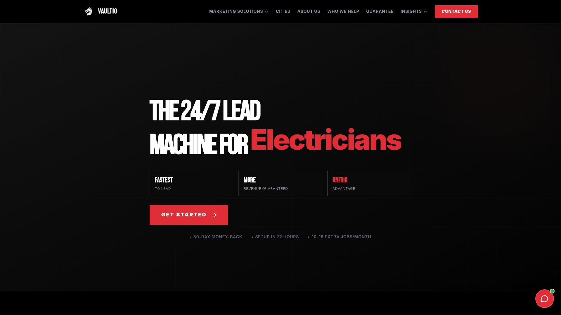
Everything in this guide, the routing logic, the trust signals, the mobile-first rules, is what we build into every electrician site we deliver. Our Web Design service pairs a conversion-focused homepage with fast lead response, so a routing form doesn't just collect information, it triggers a reply in seconds. For contractors who want the website paired with ongoing local SEO, ad management, and automated follow-up, our done-for-you service packages cover the full setup. Reach out to see what a rebuilt homepage could do for your call volume.
FAQ
What makes an electrician website convert better than a basic business site?
A converting site separates emergency, residential, and commercial visitors into distinct paths instead of one generic contact page. Teardown analysis of real electrician homepages shows that sites routing urgency, scope, and trust signals separately outperform generic layouts.
How should I set my service area in Google Business Profile?
Service-area and hybrid electricians should list specific cities or postal codes, up to 20 areas, rather than relying on a mile radius, according to Google's Business Profile help. Keeping this consistent with your website's service pages avoids confusing local search results.
Do I need separate pages for emergency and planned electrical work?
Yes. Separating emergency language, including a safety note and realistic response time, from planned-work copy helps visitors self-qualify and reduces mismatched calls to your office.
What CRM or dispatch integration should a small electrical business start with?
Start with whatever connects your website's routing form directly to the system your dispatcher already uses, so new leads appear as job records without manual entry. The specific platform matters less than closing the gap between form submission and callback.
Does Vaultio build electrician websites, or just run ads?
Our Web Design service builds conversion-focused electrician sites, and we pair that with AI-powered lead response so every new inquiry gets engaged within seconds. Full packages are available through our done-for-you services page.
Sources
- —Electrician Website Design: 6 Full-Page Teardowns | Moda
- —Manage your service areas for service-area & hybrid businesses - Google Business Profile Help
- —13 Best Electrician Websites (And How to Make Yours Better) | FieldEdge
Recommended
Ready to Implement This?
We'll build your complete lead generation system in 72 hours. No contracts. 30-day money-back guarantee.